Data visualization is a critical skill for developers and data scientists alike, especially when it comes to understanding complex datasets such as weather information. In this tutorial, we will explore how to create 3D surface plots in Python, specifically visualizing various weather parameters for New York City. By the end of this tutorial, you will have a comprehensive understanding of how to implement and customize 3D surface plots using Matplotlib, allowing you to present weather data in an interactive and informative way.
Introduction
Weather data is rich in information, with numerous parameters such as temperature, humidity, and pressure interacting in complex ways. Visualizing these relationships can reveal trends and insights that raw data cannot convey. In our example, we will generate 3D surface plots that illustrate how temperature, humidity, and pressure interact, along with additional visualizations that represent a 24-hour temperature forecast and the influence of wind on temperature.
Current Weather Conditions
This snippet initializes and converts current weather conditions from imperial to metric units, demonstrating basic variable assignment and unit conversion.
📚 Recommended Python Learning Resources
Level up your Python skills with these hand-picked resources:
Academic Calculators Bundle: GPA, Scientific, Fraction & More
Academic Calculators Bundle: GPA, Scientific, Fraction & More
ACT Test (American College Testing) Prep Flashcards Bundle: Vocabulary, Math, Grammar, and Science
ACT Test (American College Testing) Prep Flashcards Bundle: Vocabulary, Math, Grammar, and Science
Leonardo.Ai API Mastery: Python Automation Guide (PDF + Code + HTML
Leonardo.Ai API Mastery: Python Automation Guide (PDF + Code + HTML
100 Python Projects eBook: Learn Coding (PDF Download)
100 Python Projects eBook: Learn Coding (PDF Download)
HSPT Vocabulary Flashcards: 1300+ Printable Study Cards + ANKI (PDF)
HSPT Vocabulary Flashcards: 1300+ Printable Study Cards + ANKI (PDF)
# ----------------------------- Current Conditions (NYC) ---------------------
current_temp = 70            # °F (~21°C typical for NYC September)
current_humidity = 65        # %
current_pressure = 30.05     # inHg (~1018 mb)

# Convert to metric where needed
current_pressure_mb = current_pressure * 33.86
current_temp_c = (current_temp - 32) * 5 / 9

print("🌤️ 3D Weather Surface Plot for New York City")
print("=" * 50)
print(f"Current Conditions (Sep 15, 2025):")
print(f"Temperature: {current_temp}°F (~{current_temp_c:.1f}°C)")
print(f"Humidity: {current_humidity}%")
print(f"Pressure: {current_pressure} inHg (~{current_pressure_mb:.0f} mb)")
print("=" * 50)
This tutorial is particularly useful for meteorologists, data analysts, and developers interested in data science and visualization techniques. By the end, you’ll be equipped with tools to create engaging visualizations that can inform decision-making processes or enhance reports.
Prerequisites and Setup
Before diving into the code, ensure you have the following prerequisites:
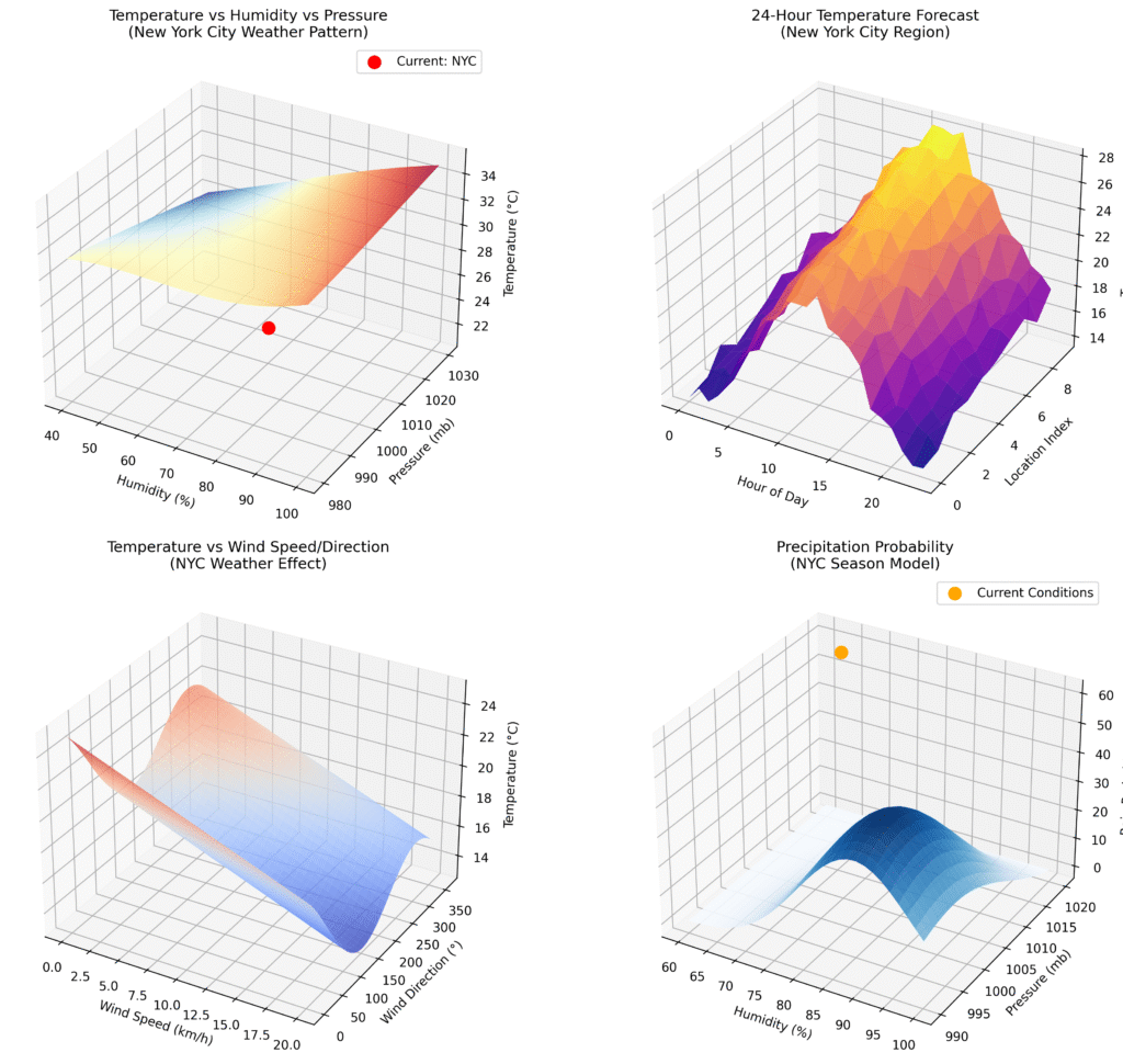
3D Surface Plot of Temperature vs Humidity vs Pressure
This snippet creates a 3D surface plot visualizing the relationship between temperature, humidity, and pressure, showcasing the use of meshgrid and surface plotting in Matplotlib.
# 1A. Temperature vs Humidity vs Pressure (NYC Pattern)
ax1 = fig.add_subplot(221, projection='3d')

humidity_range = np.linspace(40, 100, 50)  # 40–100% humidity
pressure_range = np.linspace(980, 1030, 50)  # 980–1030 mb pressure
H, P = np.meshgrid(humidity_range, pressure_range)

T = 25 + 10 * (H/100) - 0.02 * (P - 1000) + 3 * np.sin(H/20) * np.cos(P/50)

surface1 = ax1.plot_surface(H, P, T, cmap='RdYlBu_r', alpha=0.8, edgecolor='none')
ax1.set_xlabel('Humidity (%)')
ax1.set_ylabel('Pressure (mb)')
ax1.set_zlabel('Temperature (°C)')
ax1.set_title('Temperature vs Humidity vs Pressure\n(New York City Weather Pattern)')- Python 3.x: Make sure you have Python installed on your system.
- Matplotlib: This library is essential for creating static, animated, and interactive visualizations in Python. You can install it via pip:
- NumPy: This library is vital for numerical computations and array manipulations. Install it using pip as well:
To install the required packages, open your terminal or command prompt and run the following commands:
pip install matplotlib numpyOnce you have the necessary packages, you’re ready to begin creating stunning 3D visualizations!
Core Concepts Explanation
Before we jump into the implementation, let’s break down some key concepts that will be crucial as we work through our 3D surface plots:
24-Hour Temperature Forecast Plot
This snippet generates a 3D surface plot for a 24-hour temperature forecast, illustrating the use of sine functions and random noise to simulate realistic temperature variations.
# 1B. Time-based Weather Surface (24-hour forecast)
ax2 = fig.add_subplot(222, projection='3d')

hours = np.arange(0, 24, 1)
locations = np.arange(0, 10, 1)
TIME, LOC = np.meshgrid(hours, locations)

base_temp = 21  # °C typical for NYC
TEMP_FORECAST = (base_temp + 5 * np.sin((TIME - 6) * np.pi / 12) +
                 LOC * 0.5 - 2.5 + 2 * np.random.normal(0, 0.3, TIME.shape))

surface2 = ax2.plot_surface(TIME, LOC, TEMP_FORECAST, cmap='plasma', alpha=0.9)
ax2.set_xlabel('Hour of Day')
ax2.set_ylabel('Location Index')
ax2.set_zlabel('Temperature (°C)')
ax2.set_title('24-Hour Temperature Forecast\n(New York City Region)')
1. 3D Surface Plots
A 3D surface plot is a graphical representation of a three-dimensional dataset. Each axis corresponds to a different variable, allowing us to visualize the relationship between them. In our case, we will explore the interactions between temperature, humidity, and pressure.
2. Meshgrid Function
The meshgrid function in NumPy is instrumental in creating a rectangular grid out of two one-dimensional arrays representing the Cartesian indexing or Matrix indexing. This function will help us create the grid needed for our surface plots.
3. Matplotlib Axes3D
Matplotlib’s Axes3D module enables us to generate 3D plots. It provides methods to create plots that are visually appealing and informative, enhancing the interpretability of our data.
Step-by-Step Implementation Walkthrough
Now that we have a solid understanding of the core concepts, let’s walk through the implementation of our 3D surface plots for New York City weather data.
Wind Speed and Direction Effect on Temperature
This snippet visualizes how wind speed and direction affect temperature, demonstrating the application of trigonometric functions in modeling weather phenomena.
# 1C. Wind Speed vs Direction vs Temperature
ax3 = fig.add_subplot(223, projection='3d')

wind_speed = np.linspace(0, 20, 40)  # km/h
wind_direction = np.linspace(0, 360, 40)  # degrees
WS, WD = np.meshgrid(wind_speed, wind_direction)

TEMP_WIND = (current_temp_c - 0.3 * WS +
             3 * np.sin(np.radians(WD - 225)) +
             2 * np.cos(np.radians(WD/2)))

surface3 = ax3.plot_surface(WS, WD, TEMP_WIND, cmap='coolwarm', alpha=0.8)
ax3.set_xlabel('Wind Speed (km/h)')
ax3.set_ylabel('Wind Direction (°)')
ax3.set_zlabel('Temperature (°C)')
ax3.set_title('Temperature vs Wind Speed/Direction\n(NYC Weather Effect)')
1. Initialize Current Weather Conditions
In our code, we start by initializing the current weather conditions such as temperature, humidity, and pressure. We also convert these values into metric units for better interpretation, particularly if our audience is accustomed to using the metric system. This step illustrates the significance of unit conversion in data representation.
2. Create the 3D Surface Plot for Temperature, Humidity, and Pressure
Next, we create our first 3D surface plot, which visualizes the relationship between temperature, humidity, and pressure. By utilizing the meshgrid function, we prepare our data for surface plotting. This plot will help users understand how varying humidity levels can affect temperature at different pressure levels.
3. Generate a 24-Hour Temperature Forecast Plot
To enhance our visualization, we will generate a second 3D surface plot that illustrates a 24-hour temperature forecast. Here, we will introduce a sine function to simulate the cyclical nature of temperature changes throughout the day, adding random noise to increase realism. This plot demonstrates how mathematical modeling can be employed in weather forecasting.
4. Visualize the Effect of Wind on Temperature
Our third plot focuses on how wind speed and direction influence temperature. By employing trigonometric functions, we can simulate the effect of wind on temperature readings. This plot provides an insightful view of atmospheric conditions and their implications for weather patterns.
Advanced Features or Optimizations
While the basic implementation gives you a solid foundation, there are several advanced features and optimizations you can consider:
Heat Index Surface Plot
This snippet creates a 3D surface plot for the heat index, illustrating how temperature and humidity combine to affect perceived heat, which is crucial for understanding comfort levels in weather analysis.
# ----------------------------- Figure 2: Heat Index Surface ------------------
fig2 = plt.figure(figsize=(12, 8))
ax5 = fig2.add_subplot(111, projection='3d')

temp_range = np.linspace(15, 35, 50)      # °C
humidity_range = np.linspace(30, 100, 50) # %
T_grid, H_grid = np.meshgrid(temp_range, humidity_range)

HI = (T_grid + 0.5 * (T_grid - 20) * (H_grid/100) +
      0.1 * ((H_grid/100)**2) * (T_grid - 26)**2)

surface5 = ax5.plot_surface(T_grid, H_grid, HI, cmap='Reds', alpha=0.9,
                            linewidth=0.5, antialiased=True)

ax5.set_xlabel('Temperature (°C)')
ax5.set_ylabel('Humidity (%)')
ax5.set_zlabel('Heat Index (°C)')
ax5.set_title('Heat Index Surface Plot\nNew York City Weather Analysis')- Interactivity: Using libraries like Plotly or Bokeh can enhance your visualizations by allowing users to interact with the plots (zooming, panning, etc.).
- Real-time Data: Integrate APIs that provide real-time weather data to dynamically update your plots.
- Custom Styling: Customize the aesthetics of your plots (colors, labels, and titles) to match your brand or presentation style.
Practical Applications
The skills you acquire from this tutorial can be applied in various fields:
- Weather Forecasting: Meteorologists can utilize these tools to visualize and communicate weather forecasts effectively.
- Environmental Studies: Researchers can analyze the impact of climate change by visualizing historical weather data.
- Data Journalism: Journalists can create engaging visual content to communicate weather-related stories to the public.
Common Pitfalls and Solutions
As with any coding project, you may encounter challenges. Here are some common pitfalls and their solutions:
- Plot Overlapping: Ensure your data ranges are adequately defined to prevent overlapping plots. Adjust the ranges appropriately in your meshgrid setup.
- Scaling Issues: If your plots look distorted, check the aspect ratio of your axes. Matplotlib allows you to set equal aspect ratios to maintain the correct proportions.
- Performance Concerns: For large datasets, performance can become an issue. Consider downsampling your data or using optimized functions from libraries like NumPy.
Conclusion with Next Steps
Congratulations! You’ve learned how to create 3D surface plots to visualize weather data in Python. By mastering these techniques, you can effectively communicate complex data relationships, making your analyses more impactful.
As your next steps, consider exploring additional visualization libraries, integrating real-time data sources, or applying these concepts to other datasets, such as economic indicators or social metrics. The ability to visualize data is a powerful tool that will enhance your skills as a developer and data scientist.
Happy coding!
About This Tutorial: This code tutorial is designed to help you learn Python programming through practical examples. Always test code in a development environment first and adapt it to your specific needs.
Want to accelerate your Python learning? Check out our premium Python resources including Flashcards, Cheat Sheets, Interivew preparation guides, Certification guides, and a range of tutorials on various technical areas.


 Chat on WhatsApp